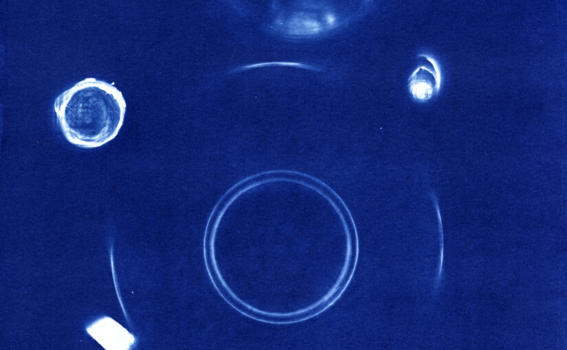
Today, I just took some random stuff only table and put it in the printing frame with a sheet of cyanotype coated paper. 5 min under the UV light, and there you go, quick and dirty. Ok, the truth, is that I was very curious to see how much light this thing would let go through. So the first exposure was 30 minutes. this was way to much. So I did go with 5 min and that works fine. Could have added a few minutes though. And this is clearly the best use of this crap I’ve ever made.
Back to the basics of cyanotype. Just put some random objects on the paper and let the light do the work. This one is poorly composed, and the main interest for me is to see how glass or other materials are working. We got glass, wood chips, and glass with water + floating wood chips.
The other day, I published a picture on Instagram, and was thinking I would like to have something like that printed with Cyanotype (this is the last one here). So there I went to download the picture from my phone and make a digital negative out of it. And then while I was browsing the pics in my Instagram folder, I just can’t help it but picking up a bunch to make some prints. And I guess I’m gonna use this material. I’m clearly not a big fan of digital photography, I just don’t enjoy using a photo editing software. I have tons of pictures on HDD that are not sorted and not processed, just because I don’t feel like doing that. Instead I prefer going to the dark room and craft some pictures. So Insta for me is a good bargain, I get some processed pictures in a minute. And then I can use this raw material to go further in the process.
Here we go again with some cyanotype experiments. Today, we are comparing side by side the same image with EDN curves and without it. The methodology is what it is. Not perfect :
same paper coated during the same batch
same exposure time (let’s say +- 1 sec) with the same exposure unit
The two negatives only differ by applying a curve that was generated with the EDN method. One drawback is that the paper was not from the same coating batch when I prepared for the EDN thing. Though it is the same paper and same batch of chemistry.
Now lets look at the results :
On the left, without the correction curves, we have stronger contrast and deep dark blue.
on the right, with the correction curves applied to the negative, we have a more balanced image and we are getting more details in the shadows.
So the conclusion, is obviously that there’s a difference. I used an already contrasted image on purpose, and to me the curve do not bring much in that case. But if we got a landscape with lots of details I’ll use these curves to make sure I’m not losing those details in the shadows (for instance in the trees).
This is what I really enjoy as a vacations : hiking in the mountains and taking pictures. This is in the south of the French Alps in a region called Champsaur. For the little story, this is the place Vivian Maier comes from. There’s a little Museum in one of the small Villages. This is not a place with high peaks covered with eternal snow, but you can get up to 3100m. That’s enough to get a very nice view on the other well known peaks like “Meije”, “Rateau” or “Barre des Ecrins”. But back to this picture, here we are not so high in the mountain, this is near the start of one of the hike we usually do in the Valley of Roanne, and that takes us to the top of “Petite Autane”. That day I was carrying my Fuji GW690 camera. And I have to say, I enjoy a lot using this camera. The patch of the rangefinder is just bright and sharp. And talking about sharp, I think these are the first scans I’m doing from negatives produced with this camera, and hell they are sharp too. So I decided to give it a shot with an enlarged digital negative and print it with cyanotype. Then toned in coffee. And here we go with an image that I like. Nothing special about it, but the level of details and the tonal range please me enough to enjoy it. Hope you’ll enjoy it too.